Giovanni Valderas for Oak Cliff
An underdog running for Dallas City Council

About Giovanni Valderas
Giovanni Valderas is a prolific artist who uses a variety of mixed-media elements, such as indigenous fabrics, duct tape, paper, acrylic paint, drawing, and wood, and in September 2018 we started his campaign for Dallas City Council. His platform centered around the devastating effects of gentrification in his district.
The best-looking campaign in Dallas belongs to Giovanni Valderas […]. Valderas’ campaign put on a master class in visual political communication. His turquoise and pink signs, with an image of his sad-eyed Casita piñatas, are eye-catching. They feel both playful and subversive. There was no greater symbolism in the races this year…
Ratcliff D. (June 4, 2019), Let’s Judge the Aesthetics of Dallas’ Municipal Campaigns, D Magazine
Campaign Inspiration
Existing political branding
Tandem’s work for Alexandria Ocasio-Cortez’s 2018 campaign is incredible. They balanced Spanish and English — many times on the same piece without making English feel like the default language, which I referenced a lot. Not to mention the strong use of color, not usually associated with political campaigns.
I also referenced JFK and his posters for the way they used typography and large color fields. For certain reasons, JFK is a popular president in Dallas.
Giovanni’s Artwork
For inspiration for his campaign, I was primarily interested in Casita Triste, Text Paintings, and his site-specific installations.
The colors, the textures, and the imagery of the campaign were all directly pulled from his artwork, while the Casita Triste became the actual symbol of his run to represent Oak Cliff, District 1 in Dallas.
My body of work is often a deliberate effort to engage the Latinx community with contemporary art through public guerilla installations. By utilizing the text and characteristics of the piñata, I aim to comfortably engage underserved audiences and provoke discussion, self-reflection, and an examination of one’s circumstances. Spanglish idioms often fail English translation and are incorporated into the work. The subtext lost through translation becomes a larger metaphor for society’s misunderstanding of cultures deemed as foreign. Text is selected explicitly to reach an audience not typically served nor comfortable with art. I consider my artwork a social practice that seeks inclusivity through art placement and language. While a sentimental offering to our Latinx communities, my practice challenges dominant power structures through the most frivolous means: tissue paper.

Quién Manda, 2017

Quién Manda, 2017

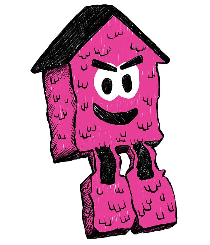
Casita Triste

Casita Triste, 2017

Casita Triste, 2018

No Hay Pedo (Canary), 2016

Ya Te Vi, 2016

Ay Te Miro (Quinceañera fuschia), 2018

Es Mi Cunado (Orange), 2016

Te Jodiste (Sheet cake blue), 2016
Local signage
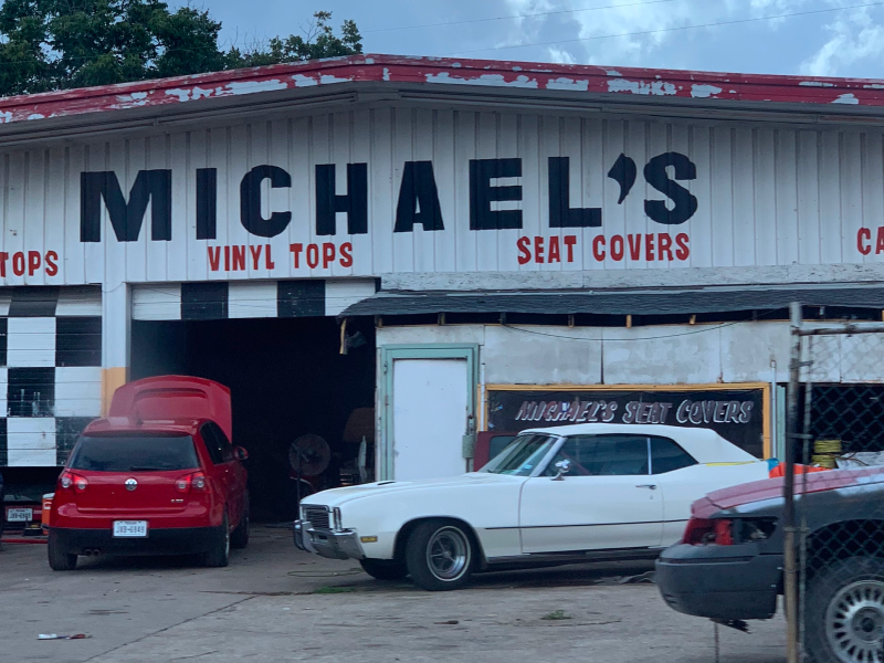
The visual culture of Oak Cliff needed to be in full view throughout the campaign, so that meant using lots of bright colors, bold typography, and most importantly, there had to been a tangible energy.
Hand-painted signage from local businesses inspired the “Giovanni Valderas” logotype and the overall typography of the campaign. Much of the time, people painted their business’ signs in all uppercase typography, and used a lot drop shadows. (Particularly, yellow drop shadows, which I thought was interesting.)


The Elements of the Campaign
Logo
Much like those hand-painted signs, I wanted the “Giovanni Valderas” logotype to be all uppercase and a little wonky in some spots. Notably, the two capital I’s in “Giovanni” are slightly tapered to feel like an inverted exclamation mark and non-inverted exclamation mark.

Typefaces
Initially I designed the logo and business cards to use Antenna, but after we printed the business cards, Antenna was no longer included in the Adobe Fonts subscription, so I need to find something else.
This was frustrating in the moment, but thankfully I found Basic Sans by Daniel Hernández right away. Basic Sans actually supported the hand-painted letterforms more than Antenna, I just wish I would have found it sooner.
The Symbol
While Giovanni had many physical “Casita Triste” artworks, I needed to create a graphical symbol for use in campaign materials. The first draft was designed to be an extendable icon but felt too corporate. It had no texture and no spirit. so I changed the approach to something more hand-drawn.

Original artwork by Giovanni

Color Palette
The color palette for Giovanni’s campaign came from the brightly colored tissue paper from his artwork, while our opponent, Chad West, used royal blue and black. We needed to create a stark contrast.

Traditional Media
Website
English and Spanish versions of the website needed to be presented as equal choices. Spanish wasn’t an add-on. Giovanni wanted to represent all of Oak Cliff, regardless of which language you spoke.
I also wrote custom CSS to hide the English navigation when you’re on the Spanish version, and to hide the Spanish navigation when you were on the English version. This tailored the website for you, no matter which language you spoke.

Welcome screen

English version of the splash screen

Spanish version of the splash screen
Yard signs
The yard sign design is what I would improve if I could redo the campaign. We had three different versions of the signs printed through the course of the campaign, and each version solved another problem, but I would have preferred to have one strong version of the sign, rather than three different designs.
The first version was designed with three colors and was unfortunately quite expensive, and the blue color we used was too dark so the black letters were practically unreadable at night. However, all was not lost. We used these versions of the sign for parades and other in-person events.
The second version of the sign was designed with just two colors to lower the cost of printing, but the casita was very difficult to get down to two colors so I removed it altogether.
In the final version of the sign, I brought the casita back because it became such a strong symbol of the campaign. The sign still needed to be two colors to save money, but in the end, the casita illustration wasn’t as high contrast as I would have hoped. The signs were screenprinted so, in theory, the pink and blue could have been layered to create a “third color” for the casita that would have solved the contrast issue. But due to the extreme time crunch, I wasn’t able to experiment much with creating halftones.

Three colors was too expensive

Two colors, no casita

two colors, and the casita returns

Our treasurer with one of the first signs.

A comparison of Giovanni's sign and Chad "Not A Cop" West's sign

The third sign with the two-color casita.
Push Cards
District 1 in Dallas was 77% Latinx and largely spoke Spanish. Throughout the campaign, we wanted to limit the language hierarchy between English and Spanish. English was not the default language, and I didn’t want Spanish to feel like it was secondary. They were both equally important.
This approach was challenging, because we had effectively half the space as our opponents to communicate anything, but it was a non-negotiable. Where we had to use both sides of the card, one for English and one for Spanish, our opponents usually only had an English version and occasionally offered a Spanish-version.

Spanish side of the first push card

English side of the first push card

Giovanni holding a campaign postcard

Spanish side of the second push card

English side of the second push card
Mailer
Giovanni’s core platform was addressing gentrification, and this mailer called attention to it. Many recipients were deeply disturbed by this imagery and the truth it was telling. We had a huge inflow of supporters and volunteers after this went out.

Back of the mailer

Front of the mailer
Commitment Cards
As we approached early voting and election day, we created commitment cards that our volunteers mailed to people in the district. These helped people define a plan outlining when and where they could vote.


Social Media
Social media, particularly Instagram, was central to the campaign. Giovanni already had a well-established social media following, which we absolutely utilized to its full potential.
Kickoff Speakers
These were the speakers at Giovanni’s kickoff party.


Early Voting
Announcements for early voting


Meet-and-Greets
We held a handful of public meet-and-greets so anyone unfamiliar with Giovanni and his platform could meet him and learn more. They were usually hosted by members of the community.


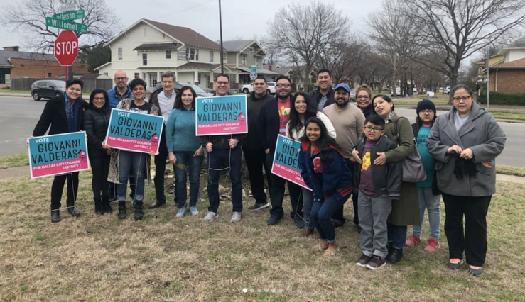
Canvassing
Knocking on doors is the best way to get the word out, and these images announced the time and places for the “block walks”.


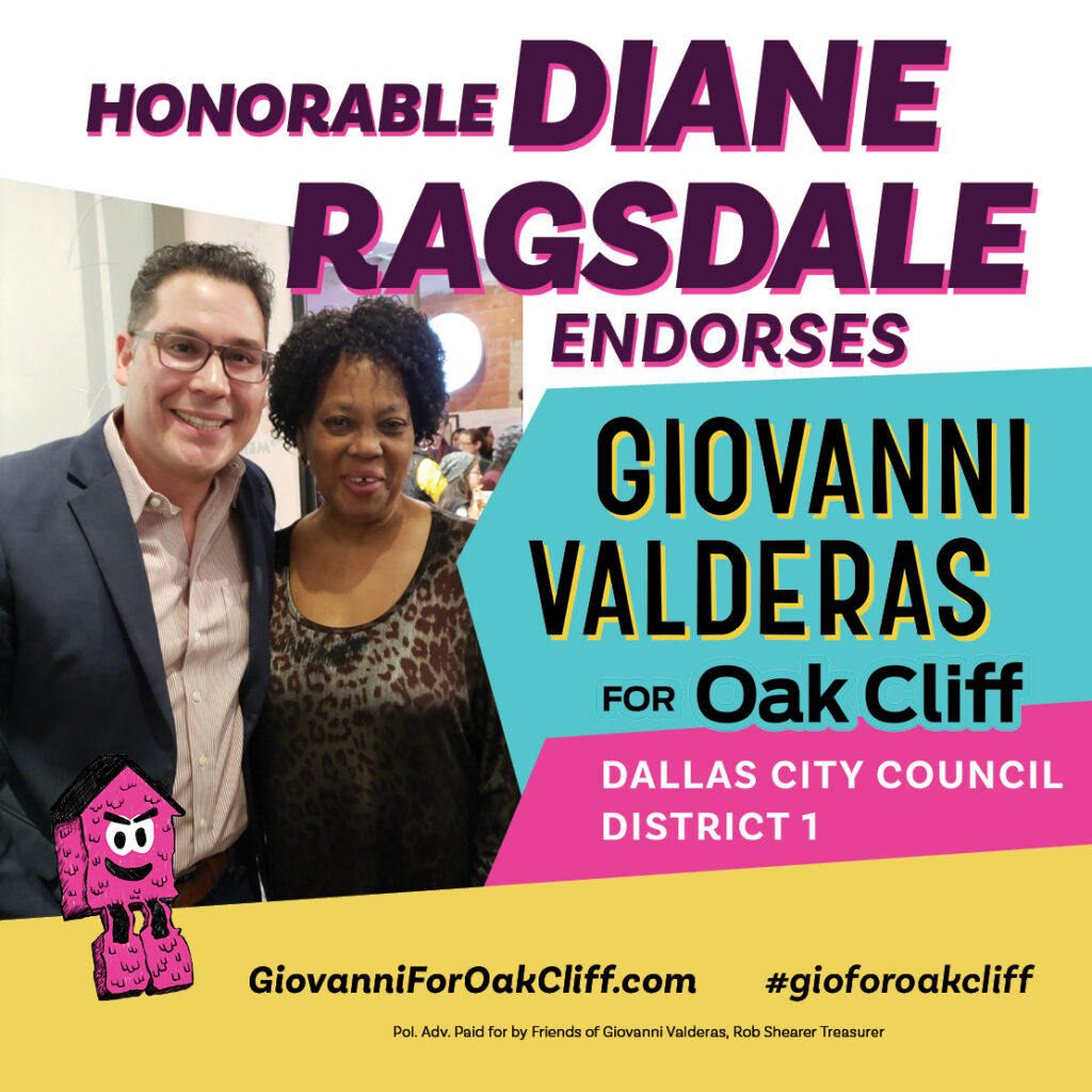
Endorsements


Campaign results
Spoiler: We lost.
- Giovanni ‘Gio’ Valderas: 2,067 (34.69%)
- Jeremy T. Boss: 107 (1.80%)
- Sylvana Alonzo: 535 (8.98%)
- Chad West: 3,250 (54.54%)
5,959 total votes were cast. For context, there are 36,984 registered voters in District 1. 77% are Latinx and have lived there for generations.


Final Thoughts
This was my first campaign I have ever worked, and I had no idea how difficult it would be. We were under an extreme time crunch all the time and very little room to make an error. We were a grassroots team with very little funding, but we made it work as best as we could.
Design-wise, there was a lot more I wish I could have done. And there were some things I would have done differently if I could do it over.
However, we received so much praise from the community and people familiar with running campaigns. We wanted the people in District 1 to know that they had someone in their corner and to know they really have a voice.
The entire campaign — not just the visuals — embodied the spirit of Oak Cliff and what we were trying to do. And I am exceptionally proud of that.