Inventing the Broadcat Brand
And why it still looks like this 10 years later

my office, 2016
About Broadcat
Broadcat, is a corporate compliance training company founded by Ricardo Pellafone in 2015. They believe compliance should be nearly invisible to the employees, and by integrating checklists, flowcharts, screensavers, and other formats into an employees’ regular workflow, employees are always getting “trained” without stepping out of their normal work.
Because frankly, no one likes corporate compliance training. If you’re lucky, you’ll get an semi-interesting video to watch a couple times a year followed by a simple quiz, and it’s been done like this since the industry started in early the 2000s.
Before Broadcat Had a Brand
In 2016, I joined as Design Lead—and first employee—eight months after the company was founded.
Back then, the company had a name, a product direction, and a market—but no cohesive brand system. This case study documents the design work that established Broadcat’s visual foundation, and 10 years later, it’s still going strong.
Broadcat’s brand was basic and fragmented back then. The typefaces were bold, condensed, and confrontational while the color scheme was made of varying shades of gray. There was very little that was engaging about Broadcat’s brand.
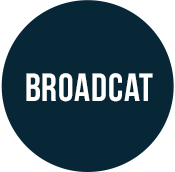
Logo (?)
The closest thing to a logo or wordmark was “Broadcat” in uppercase, condensed Franklin Gothic. I don’t think this could be more unwelcoming if you tried.
Website
The 2016 website was a gray, lifeless imitation of bleak Brutalism that felt boring even among the dystopian branding of other corporate compliance companies. It was like if Nosferatu designed a Squarespace theme.

2016 Broadcat homepage

2016 Broadcat about page
Mascot
Amidst the monolithic landscape, there was a singular element that stood out—the smiling, waving, purple Kawaii-style cat.
The founder created this cat illustration in early 2016 as a kind of mascot. Sometimes the cat wore different clothes, or it would hold various objects depending on the context. Ricardo often used the cat as an avatar of himself, often writing blog posts as “The Broadcat”.
To be honest, I had serious doubts about using a smiling purple cat literally inside the official logo, but after more discovery it became clear that people recognized the cat, and among the various compliance company branding out there — a happy purple cat certainly grabbed attention.
The cat was absolutely staying as the core of the visual brand, but it took a lot of work to develop this illustration as an official part of the identity system rather than a funny little illustration with no consistency.

the "Broadcat"
Content
The content itself is where the true strength of Broadcat was. All the content was written for average employees who, importantly, were not compliance officers or lawyers. They might have been accountants, IT professionals, or salespeople whose primary job dealt in certain risk. They needed to do that job, and not spend time deciphering legalese.
But again, the issue here was branding. Colors, layout, and typography needed to feel like it supported the content rather than work against it.
Here’s a cropped example of some early content. The full version is available on Archive.org.

An early piece that outlined what someone can give to a government official.
Building the Brand
Wordmark
The uppercase, bold, condensed typography used in the previous wordmark was intimidating and aggressive, which is the exact opposite emotion of a gleeful cartoon cat. The new letterforms needed to be soft, round, and approachable. You know, like a friendly cat.
I kept the logo in all uppercase letters to keep a sense of authority, but substantially widened the letters and added rounded paw-like serifs to move away from the angular, towering, condensed Franklin Gothic that the wordmark used previously.

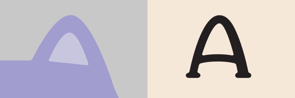
The As are modeled after the cat’s ears.

The serifs are modeled after cat paws.
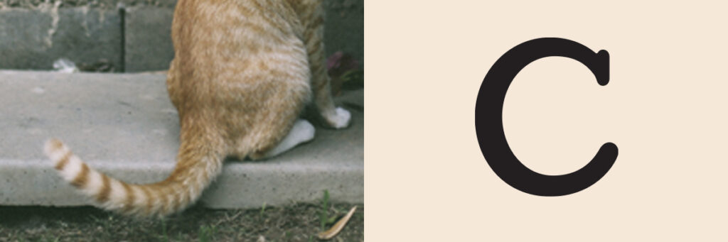
The C is modeled after a cat tail.
Logos (full color)
Since the cat illustration wasn’t originally created to be part of the logo, the design team needed to figure out how it could work in the logo. Rachel Leite designed the logo lockups in their various orientations.


Logos (single color)
Every successful brand identity needs single color versions of its logo, and Broadcat was no different.
We developed the single color logo for darker backgrounds by removing the “shadows” colors in the cat so a darker background color would fill those spaces to keep the cat recognizable.

The Challenge
However, developing the single color version for lighter backgrounds presented a challenge. Simply inverting the single color version for darker backgrounds resulted in a true horror. The eyes and mouth are reading as cavities, rather than facial features, so this wasn’t going to work.

This would frighten children.

We started with an outline-only version of the full-color logo then experimented by filling in some shapes, keeping some shapes outlined, and removing some lines altogether.

This version felt too much like it was floating without the bottom line under the cat.

This version was attempting to balance out the missing line with darker ears, but drew too much attention to them.

Then after adding the line under the cat, the whole cat became too heavy overall.

We landed on keeping the darker line under the cat, and removing the weight from the ears which gave us the right balance overall.
Colors
To create a friendly and relaxing brand atmosphere, we needed to move away from the brutalist hellscape.
I build the first website in WordPress using Google Material design as a starting point, and its built-in purple and teal worked really well with the brand atmosphere that we were creating, so these two became the core colors.

I considered using plaid to evoke the friendly feeling of a picnic, but decided 17 seconds later that this was a terrible idea.

yikes, visual overload
The plaid pattern was trash, but it did lead to a nice discovery; the slate in the overlap was a nice tertiary color to round out the color scheme. As the Broadcat brand grows and develops its own voice, our color scheme has grown up from the Google Material design color scheme.

Later we added more shades, tints, and auxiliary colors to give us other options for bringing attention in different ways.


Typefaces
I chose Open Sans as the primary typeface. The characters have the same kindness that the wordmark has, there are a large number of weights to work with, and it’s very easy to read.
Also, Open Sans is available on Google Fonts which made implementation fast, free, and easy — all very important when you’re the first employee at a startup.
Shapes
The shapes Broadcat used in the brand needed to feel bubbly and friendly, by minimizing the number of sharp angles and points. Much of the surface-level elements was the content itself, but we also used buttons, icons, and banners.
Our goal was to use simple shapes and curves then baby-proof everything.
icon background

banner

buttons
Atmospheric shapes
Breaking the frame to create layers allowed us to guide the viewer around the content, without always putting a large headline at the top. We could use certain shapes and colors to pull attention wherever we needed.

the arc

the rectangle

the rubber-band

the wave
Layering
Broadcat’s brand was designed to use layers and hammerspace to create a shallow 3D space. We wanted the brand elements to feel as simple as crafting with construction paper.
In cartoons, hammerspace is the infinite space that a character hides their giant hammer or other impossibly large objects. It’s often behind their back or in their pocket. The cat frequently jumped out of hammerspace when we couldn’t find a natural place to align the bottom of the cat to another flat line.
Subtle shadows were used when marketing the licensed content, but importantly, shadows were prohibited from the cat illustration because it made it too flat.


Applying the Brand Across Media
Standardizing Content
We created 96 icons limited to 16 colors, and each one had a very specific definition that we outlined in a usage guide. This icon system became the foundation of the content from that moment forward. Rachel Leite published a phenomenal case study showing how we developed the icon system.
The Platform
Compliance Design Club is the platform that subscribers download the content from.

The first version of Clubhouse that I designed and built

Clubhouse redesign, circa 2026

Clubhouse redesign, circa 2026
The Website and Landing Pages
The website has (thankfully) been redesigned since the early days, but the tone of the Broadcat brand remains strong.


The Book
This book was an unbelievable undertaking. It was designed by Rachel Leite, illustrated by Xinia Pirkey, and written by Broadcat’s founder Ricardo Pellafone.


Marketing Booklet
After the success of the first book, booklets kinda became the thing to do.


Extending the brand into fun stuff
Broadcat’s engaging brand was so unique in the compliance training industry, and we had a lot of fun with it. We made tons of swag that captured attention, and it didn’t take long to develop a cult-like following among compliance teams.

heavy metal "Broadcat" shirt

the go-to brand shirts

branded coasters

temporary "Compliance" tattoos
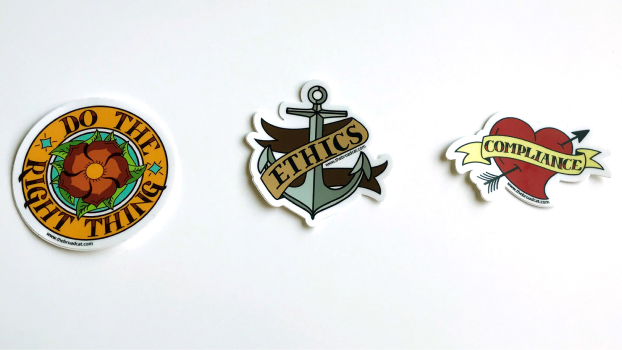
branded stickers

stamp that says "Do the right thing" in Chinese

enamel pins

early booth setup at compliance conferences
Final Thoughts
The Broadcat brand did not emerge gradually over time. but rather, it’s the outcome of a design system, approach, and an incredible design team that solved the problem from the start and has remained largely unchanged for the last decade.
The visual tone continues to be the exemplar of good design in the corporate compliance training industry, and its longevity is not the result of an accident. The first several hires were not of corporate compliance professionals but of good, smart, and hungry designers who were willing to set up camp inside a buttoned-up corporate world and push the limits.
I count myself incredibly lucky to have worked next to Rachel Leite, Xinia Pirkey, Kristen Barnett, Hanna Sirak, and Joey Meyers and I would jump at any opportunity to work with them again.
My last day at Broadcat was early 2023 after 6 1/2 years of building and extending Broadcat’s brand, and I’m incredibly proud of the work that we did.