Your cart is currently empty!
Branding a Corporate Compliance Company with Kawaii
Broadcat is a small corporate compliance and design company in Dallas, TX that was founded in 2015 by Ricardo Pellafone. I was hired as the first employee about 8 months later as the Design Lead and immediately started building a design team.
I’m extremely proud of all the work I did while I worked at Broadcat, and people honestly love the brand — especially at compliance conferences where we stand out quite a bit. Broadcat kind of developed a cult following.
Background
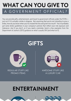
Most organizations’ compliance training is made of annual training videos, quizzes, verbose policies, and webinars, and it’s been done like this since the beginning of the industry. The obvious downside is that those methods on their own don’t help employees do their jobs more effectively nor does it help keep them from making mistakes.
Broadcat believes compliance should be nearly invisible to the employees by integrating task-specific checklists, decision-trees, screensavers, and bunch of other formats into employees’ workflows right when they need it. Our content reinforces compliance messaging in plain-language without interrupting employees while they’re just trying do their jobs.
The existing brand
Broadcat’s visual brand was basic and a little fragmented when I joined. The typefaces were bold and condensed, and the color scheme was a lot of gray.
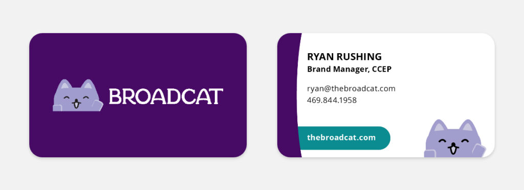
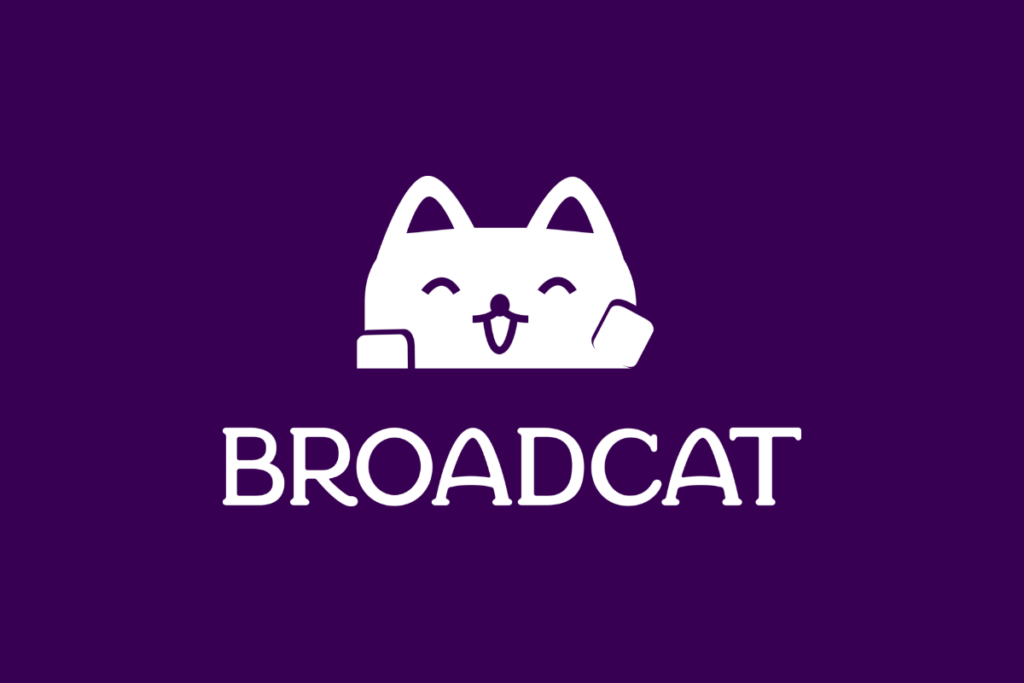
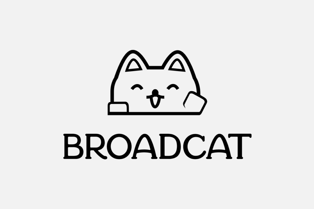
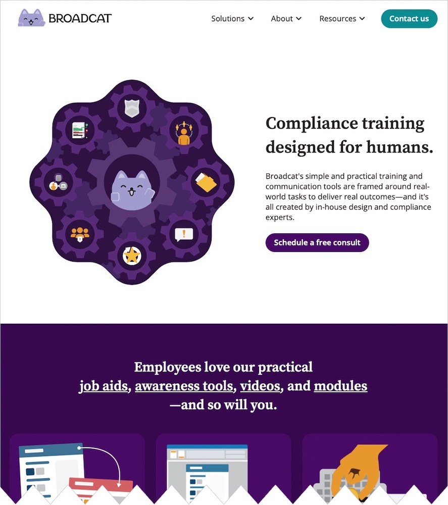
The strongest visual element was the smiling, waving, purple Kawaii-style cat that was used as the primary logo.
However there were no alternate orientations, no single color versions, no wordmark, and he was quite out of place in his brutalist environment.

Beyond any existing visual brand assets, the “just-in-time” methodology and the simple content was the key for expanding the visual brand. The content has always been written in plain language for employees to read, understand, and use. This is wildly different than any other traditional compliance stuff.
Keeping the good bits
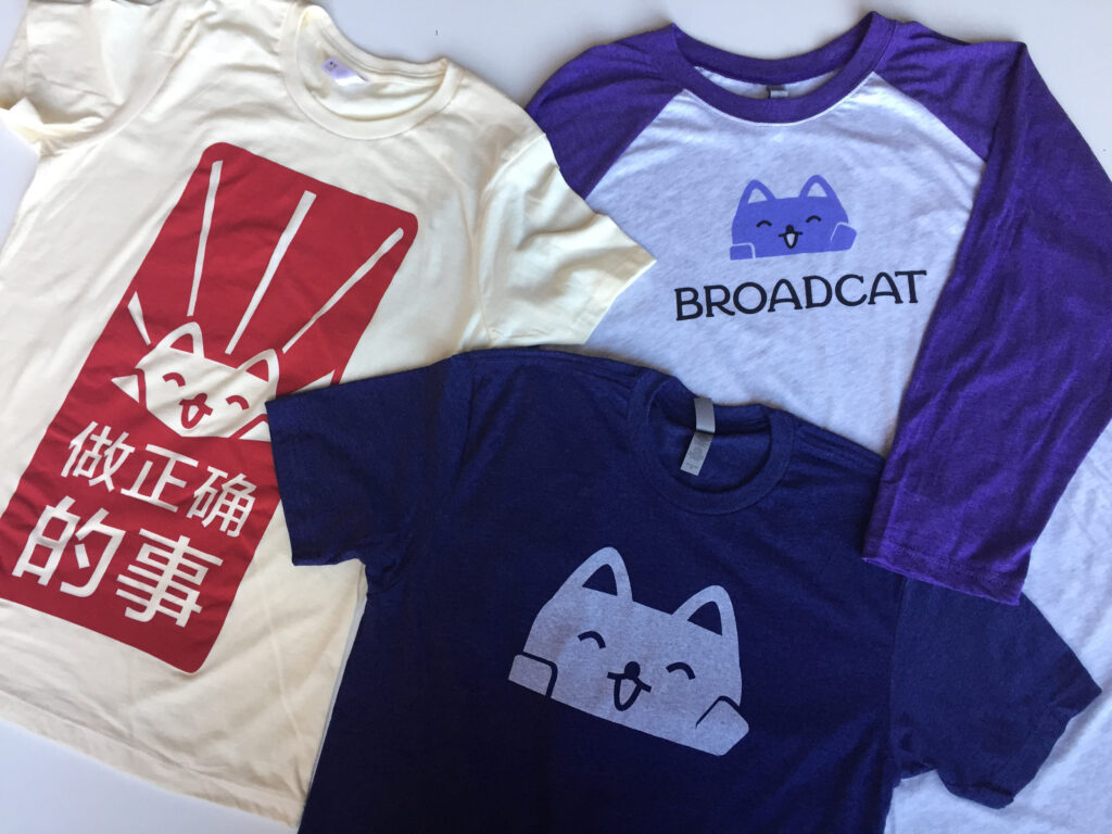
In addition to using the purple cat as the primary logo, it was also used as a mascot everywhere. Sometimes he wore different clothes, or he would hold various objects depending on the context. To be honest, I had serious doubts about using the purple cat literally inside the official logo, but after more discovery it became clear that people recognized the cat, and among the various compliance company branding out there — Broadcat certainly stood out.
The cat was absolutely staying as the core of the visual brand.
Expanding the brand to meet the quality of the content
Ok, first the wordmark
The uppercase and condensed typography created an intimidating and confrontational emotion — which is the exact opposite emotion that the content created, so I developed a custom wordmark to better pair with the purple cat that already had so much brand equity built into it.
I wanted the letterforms to feel… well… like a cat.
I kept the logo in all uppercase letters to keep a sense of authority, but dramatically widened the letters and added bubbly paw-like serifs to soften the emotion and make the wordmark more readable — especially at small sizes.
Once we got the wordmark figured out, Rachel Leite designed the logo lockups in their various orientations.
Challenges
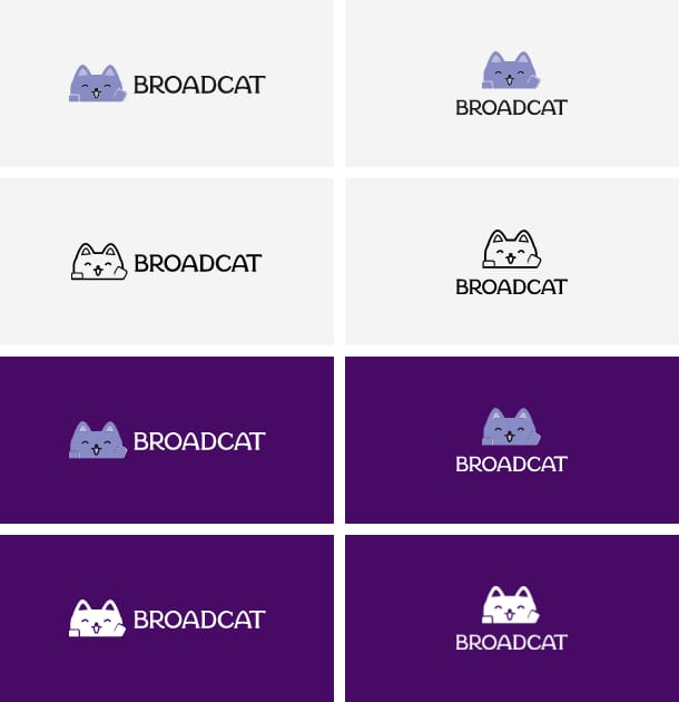
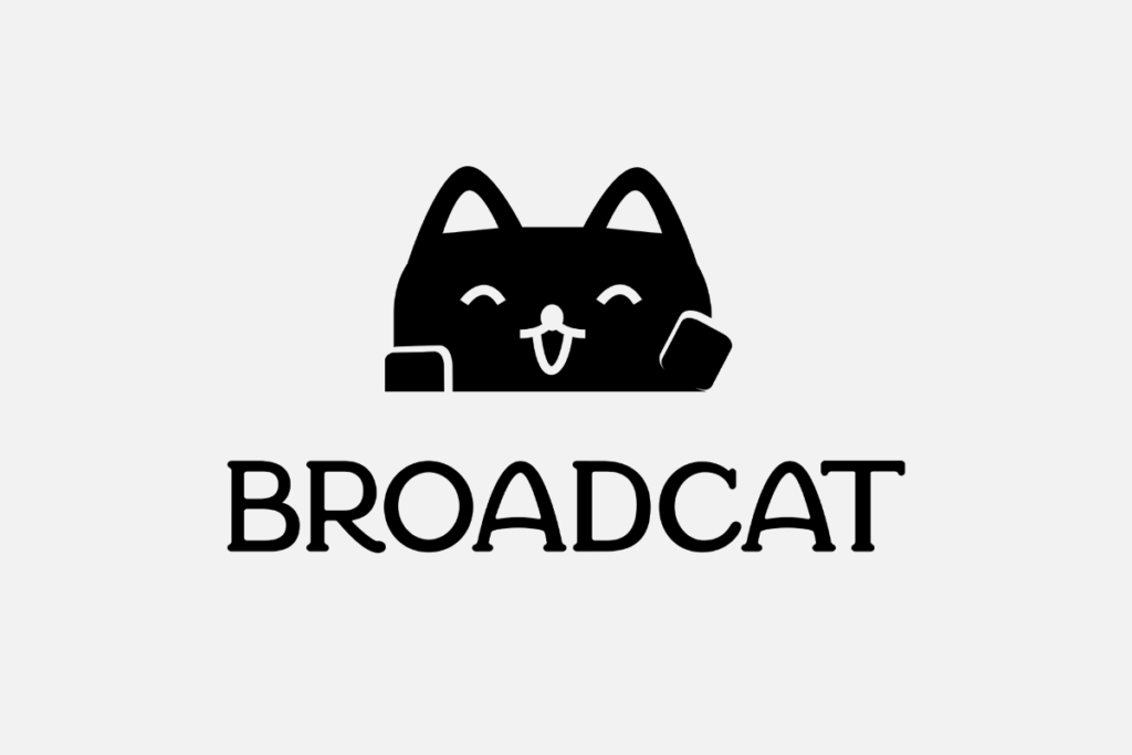
The purple cat wasn’t designed to be a part of a logo system, so there were no single-color versions for dark backgrounds and light backgrounds.
We started with the easier one first, and created the single-color for darker backgrounds by knocking out the darker colors to let the darker background come through. Easy enough.
However, inverting the colors created something of a horrifying monster.
We started with an outline-only version of the full-color logo then experimented by filling in some shapes, keeping some shapes outlined, and removing some lines altogether.
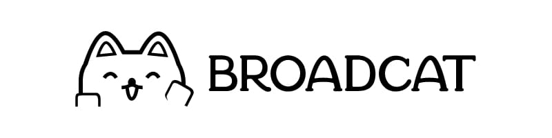

We landed on keeping the darker line under the cat, and removing the weight from the ears which gave us the right balance overall.
Typefaces
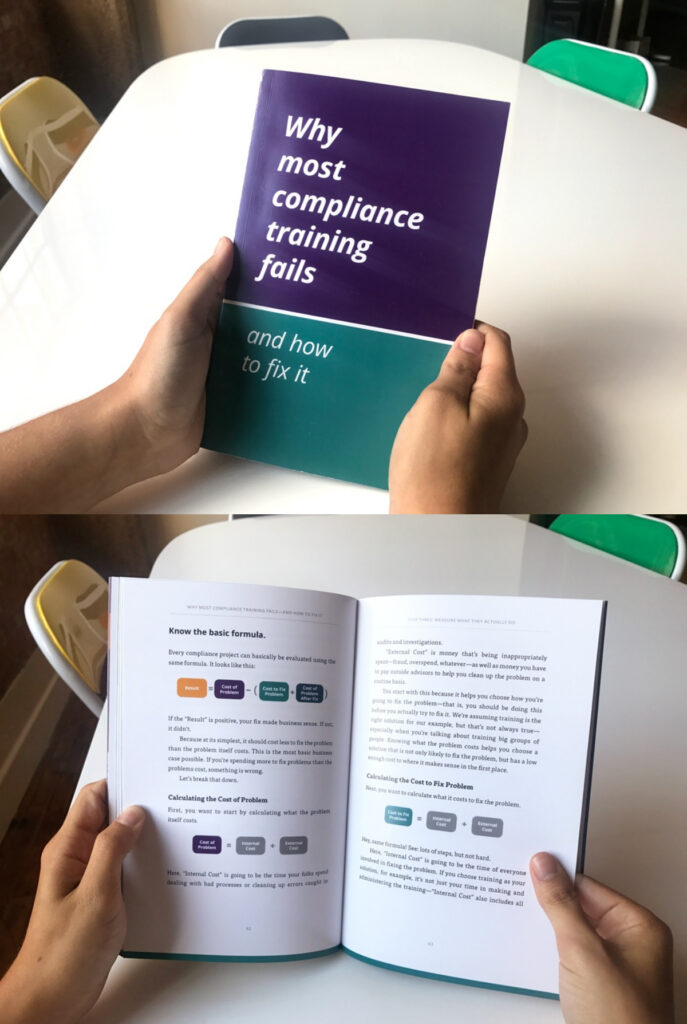
I chose Open Sans as the primary typeface. The characters have the same kindness that the wordmark has, there are a large number of weights to work with, and it’s very easy to read.
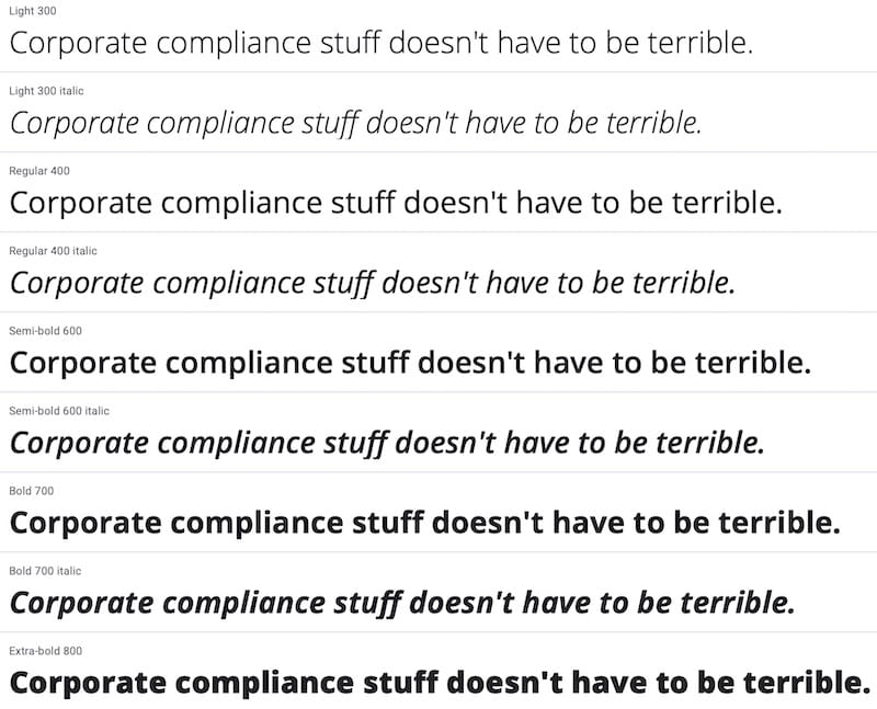
Also, Open Sans is available on Google Fonts which made implementation fast, free, and easy — all very important when you’re the first employee at a startup.
Colors
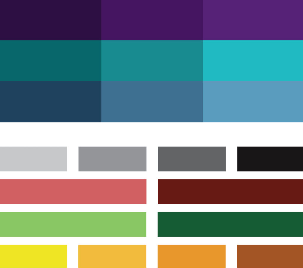
To create a friendly and relaxing brand atmosphere, we needed to move away from the brutalist grayscale.
I build the first website in WordPress using Google Material design as a starting point, and its built-in purple and teal worked really well with the brand atmosphere that we were creating, so these two became the core colors.

I considered using plaid to evoke the friendly feeling of a picnic, but decided 17 seconds later that this was a terrible idea.
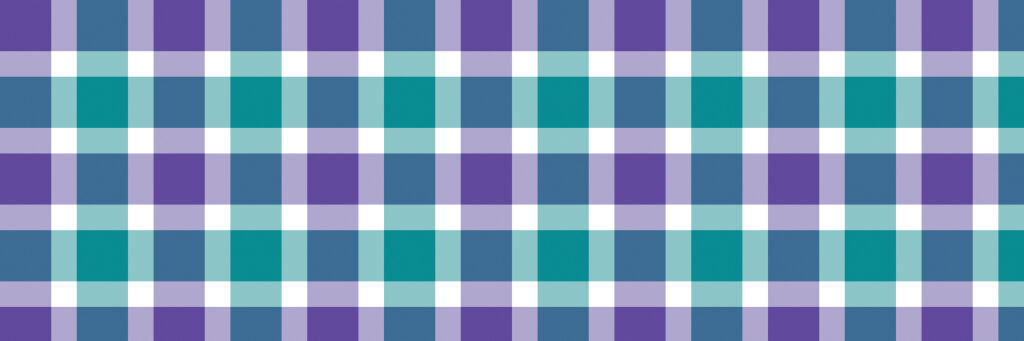
The plaid pattern was trash, but it did lead to a nice discovery; the slate in the overlap was a nice tertiary color to round out the color scheme. As the Broadcat brand grows and develops its own voice, our color scheme has grown up from the Google Material design color scheme.

Later we added more shades, tints, and auxiliary colors to give us other options for bringing attention in different ways.
Bringing all the elements together
This is how we combine all these elements to create a fun, accessible, and easy-going world for all employees.
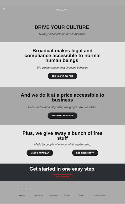
The corporate site, TheBroadcat.com
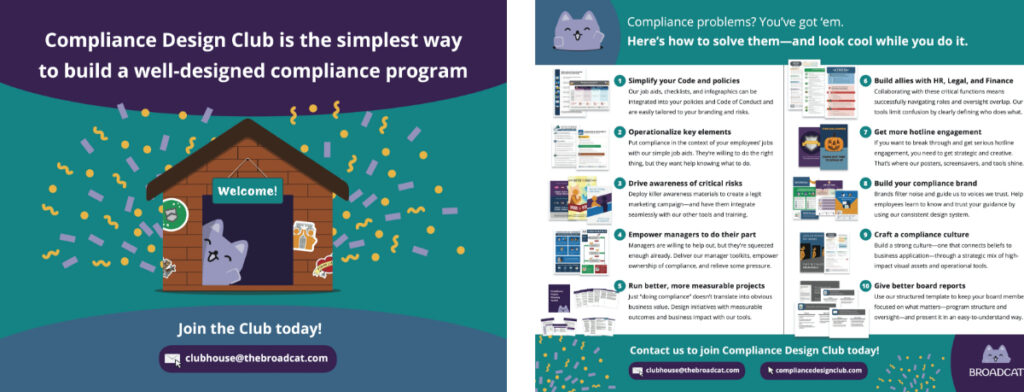
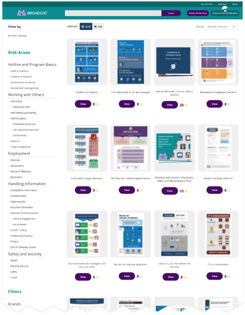
The product, Compliance Design Club
Compliance Design Club is where Design Club Members search, purchase, and download compliance materials for their organizations.
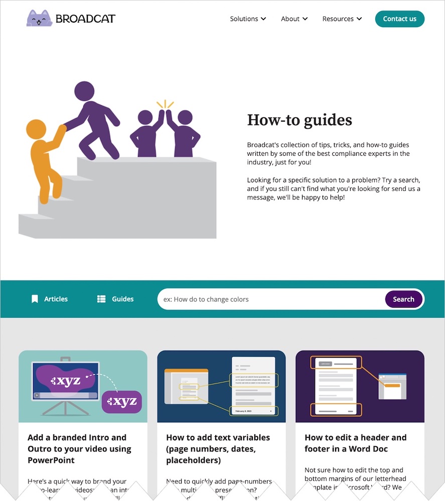
The blog, Blog.TheBroadcat.com
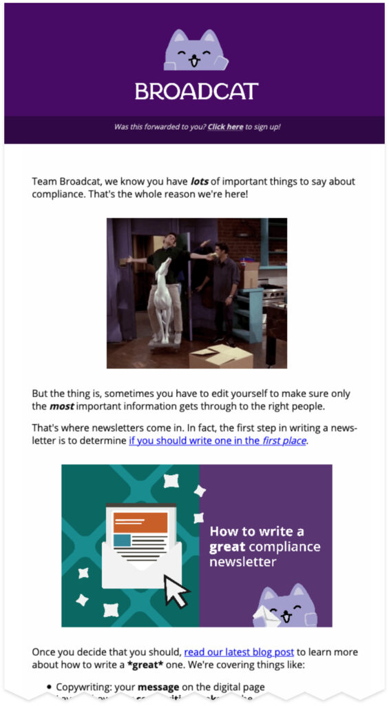
Emails
Animation
We worked with Mantas Gr to animate the logo and wordmark for use on videos.
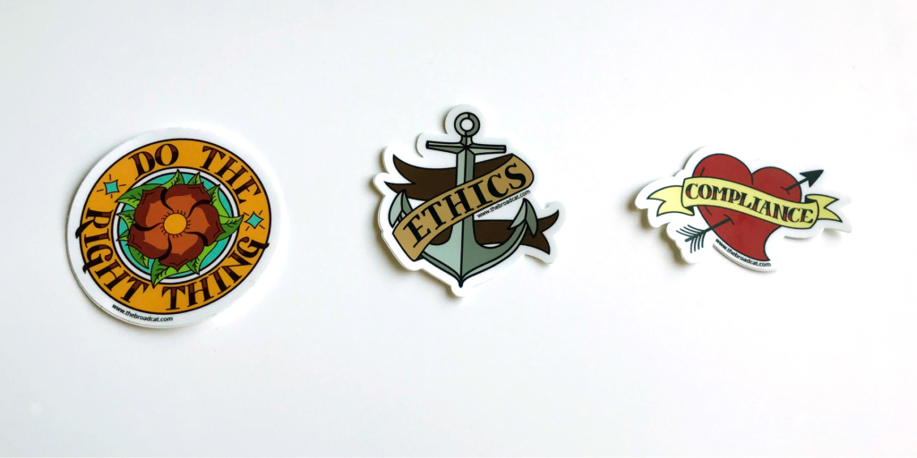
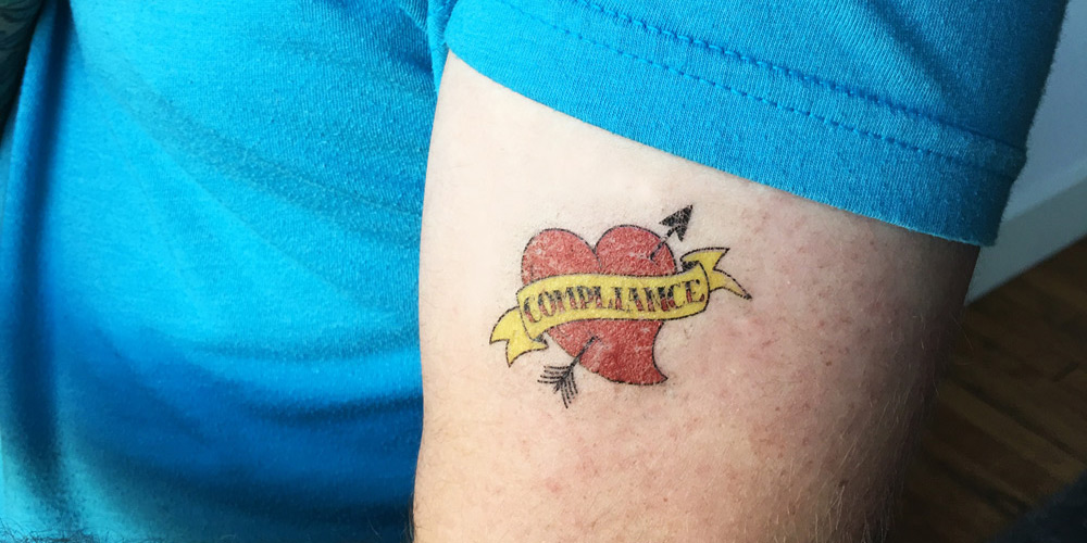
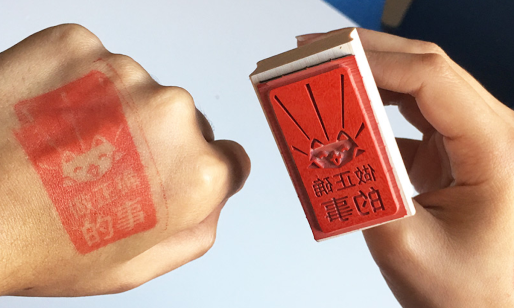
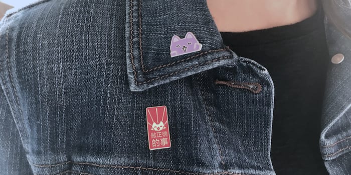
Printed collateral
Here are some various examples of how the Broadcat brand manifests into printed collateral.