Your cart is currently empty!
Branding the Artist Running for Dallas City Council
“The best-looking campaign in Dallas belongs to Giovanni Valderas […]. Valderas’ campaign put on a master class in visual political communication. His turquoise and pink signs, with an image of his sad-eyed Casita piñatas, are eye-catching. They feel both playful and subversive. There was no greater symbolism in the races this year…”
Ratcliff D. (June 4, 2019), Let’s Judge the Aesthetics of Dallas’ Municipal Campaigns, D Magazine.
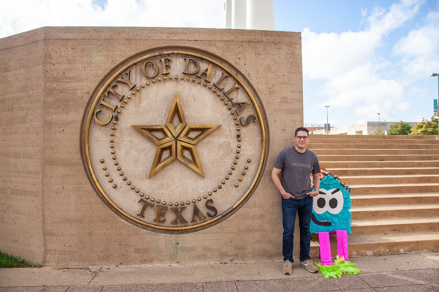
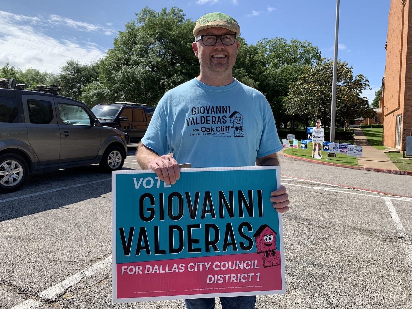
Giovanni Valderas is an artist, activist, and active member of the Dallas city government. In September 2018 we started his campaign for Dallas City Council.
Giovanni asked me to make his campaign feel like a party that everyone in Oak Cliff was invited to. I was thrilled to work with a candidate who didn’t want a boring visual identity.
Inspiration
Existing political branding
Tandem’s work for Alexandria Ocasio-Cortez’s 2018 campaign is incredible. They balanced Spanish and English — many times on the same piece without making English feel like the default language, which I referenced a lot. Not to mention the strong use of color, not usually associated with political campaigns.
I also referenced JFK and his posters for the way they used typography and large color fields. For certain reasons, JFK is a popular president in Dallas.
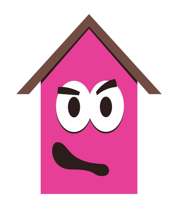
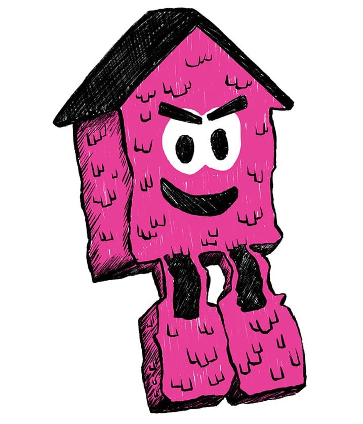
Giovanni’s artwork
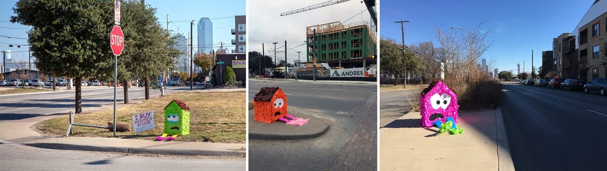
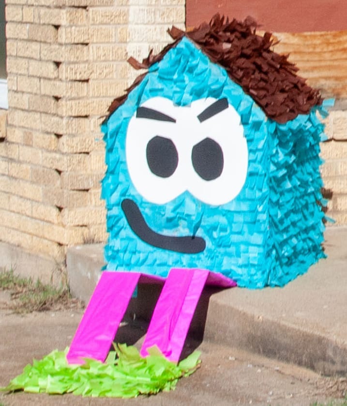
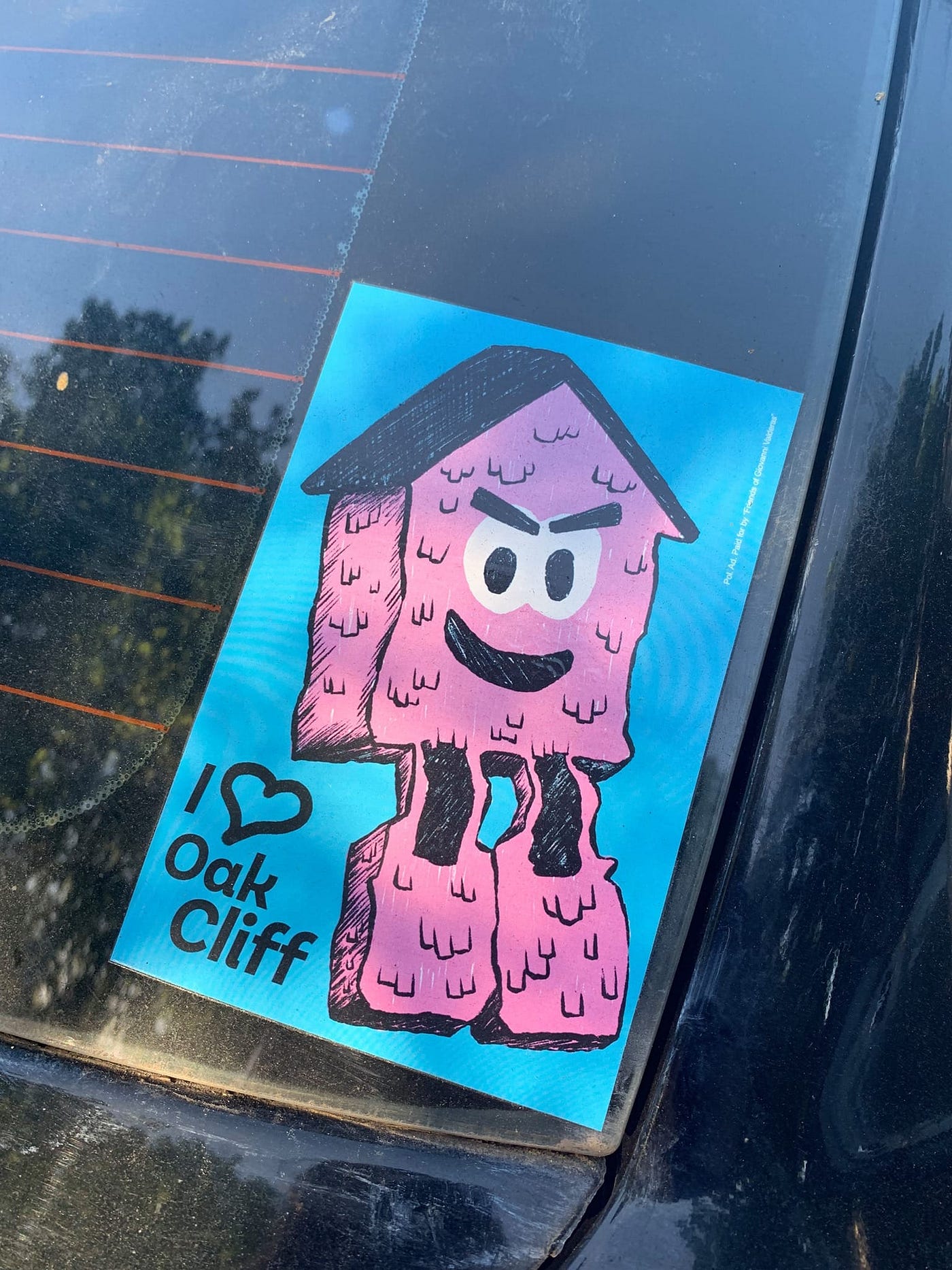
As an artist, one of Giovanni’s projects is Casita Triste. He placed sad piñata houses around Oak Cliff to bring attention to affordable housing, displacement, and gentrification, which were the issues he focused on during his campaign. Here are some examples.
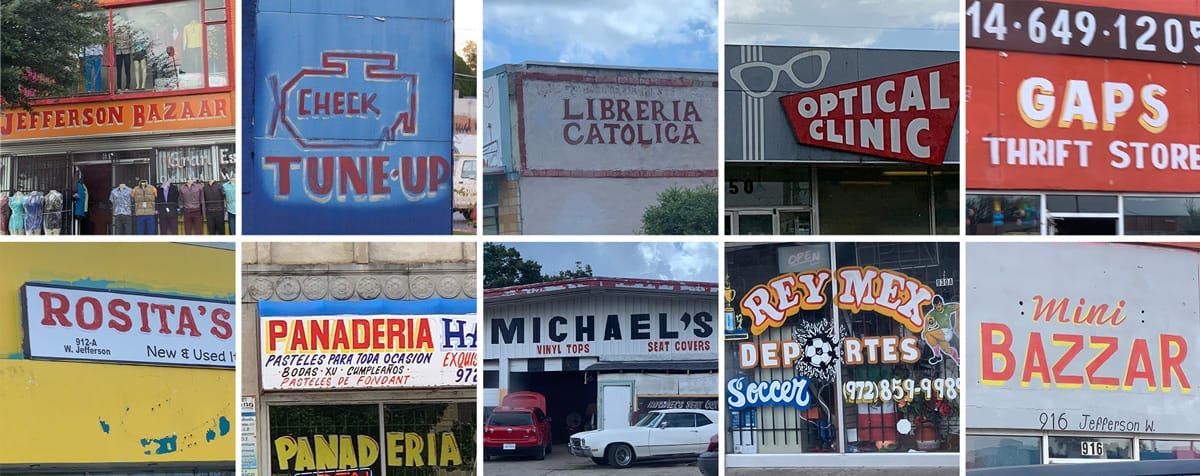
Local signage
The visual culture of Oak Cliff — Giovanni’s home and the district he wanted to represent — needed to be in full view throughout the campaign.
I referenced the signage from local businesses and their colors. Many of the signs were painted in all uppercase and used drop-shadows, particularly yellow drop-shadows for some reason.
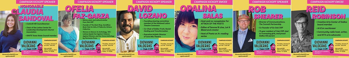
The elements of the campaign
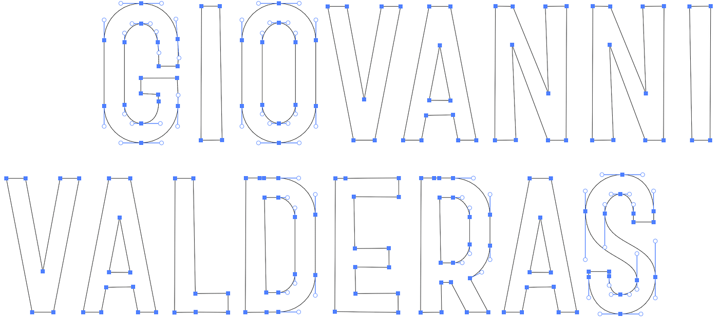
Custom lettering
Giovanni’s name is custom lettering and was inspired by the letterforms in the hand-painted signs in Giovanni’s district.
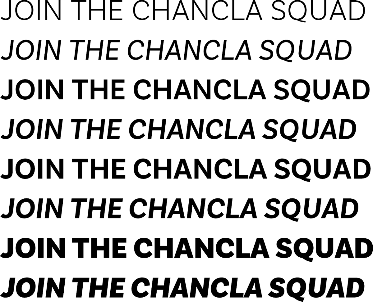
Typefaces
Initially I designed the logo and business cards to use Antenna, but something unexpected happened. About a month after we printed the business cards, Antenna was no longer included in the Adobe Fonts subscription, so I need to find something else.
This was frustrating in the moment, but thankfully I found Basic Sans by Daniel Hernández right away. Basic Sans actually supported the hand-painted letterforms more than Antenna, I just wish I would have found it sooner.
The Casita
Colors

Bringing the elements together
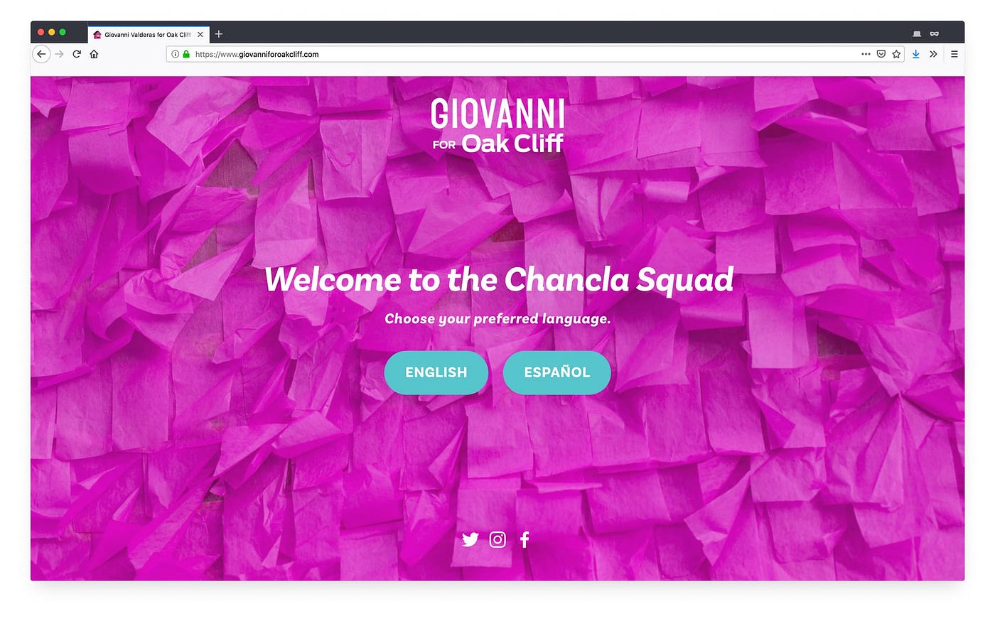
Website
English and Spanish versions of the website needed to be presented as equal choices — Spanish wasn’t an add-on. Giovanni wanted to represent all of Oak Cliff, regardless of which language you spoke.
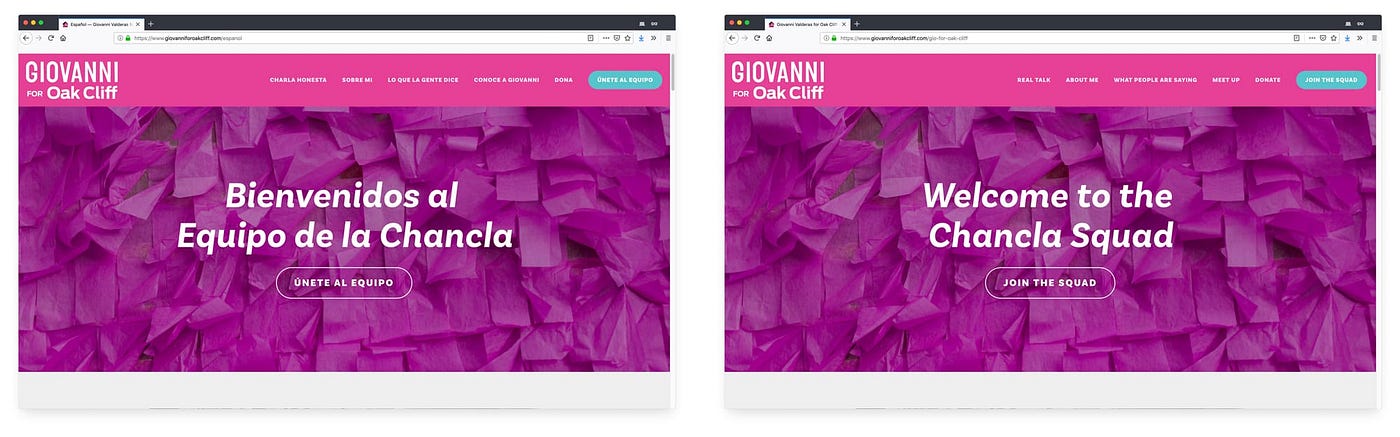
I also wrote custom CSS to hide the English navigation when you’re on the Spanish version, and to hide the Spanish navigation when you were on the English version. This was to create a sense that the website was tailored for you, no matter which language you spoke.
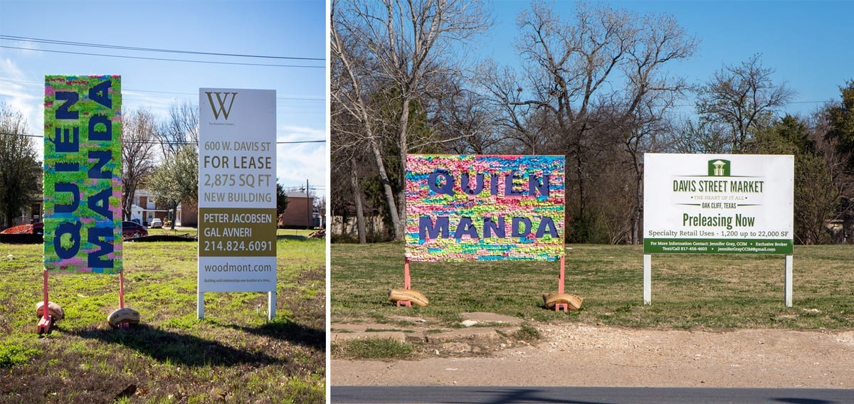
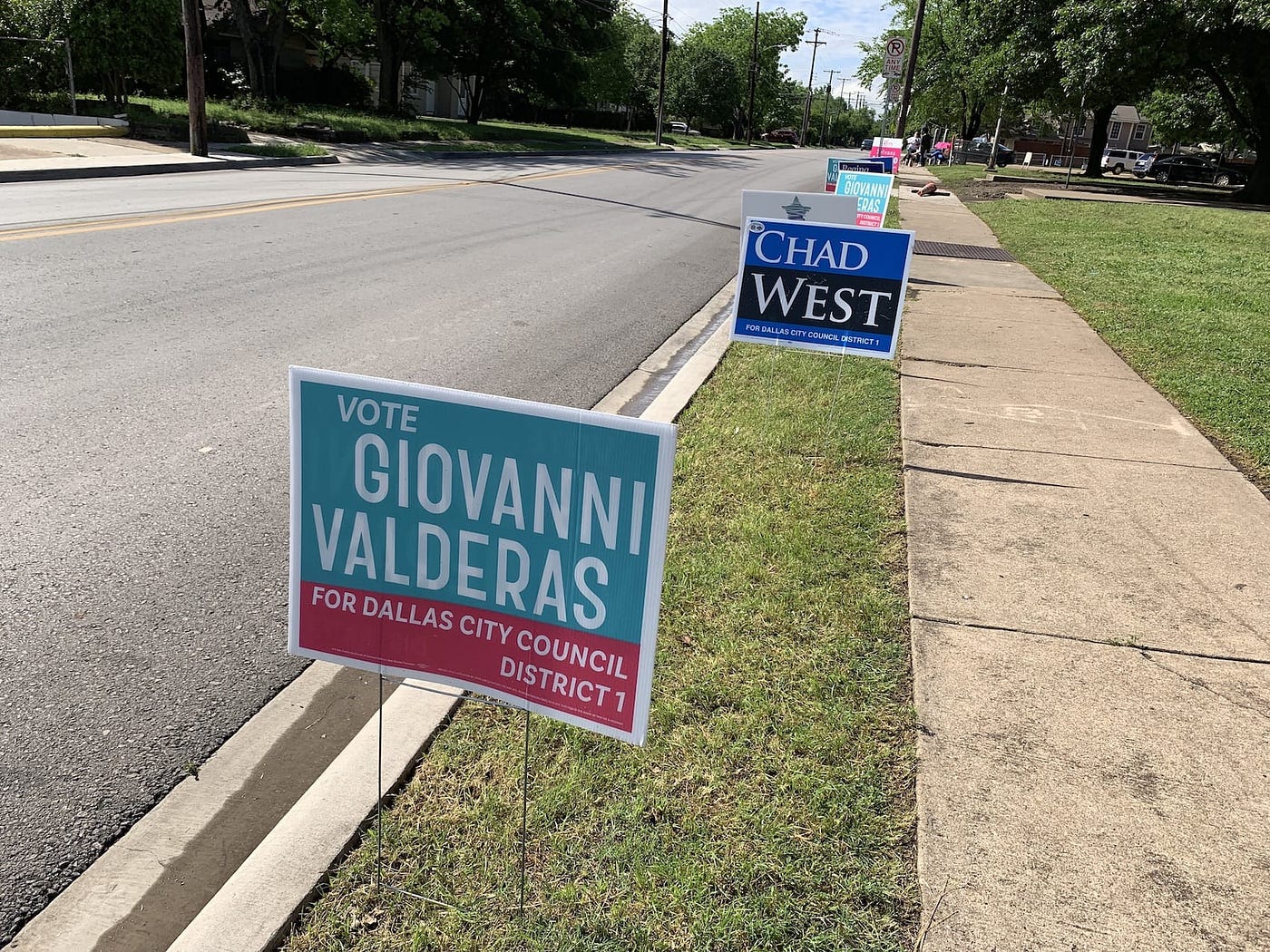
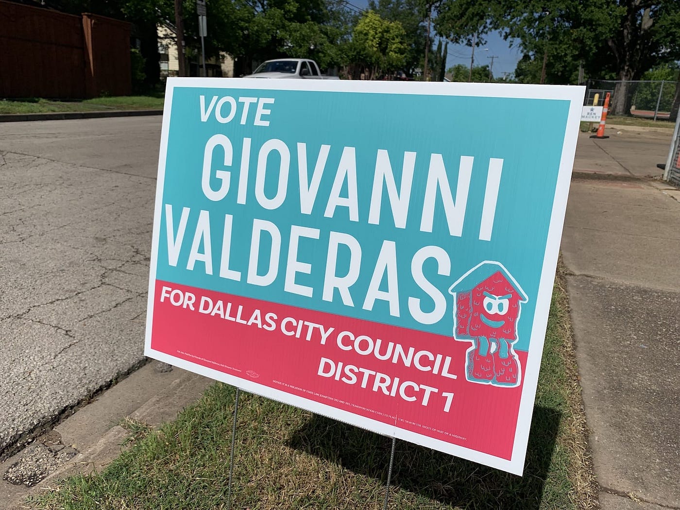
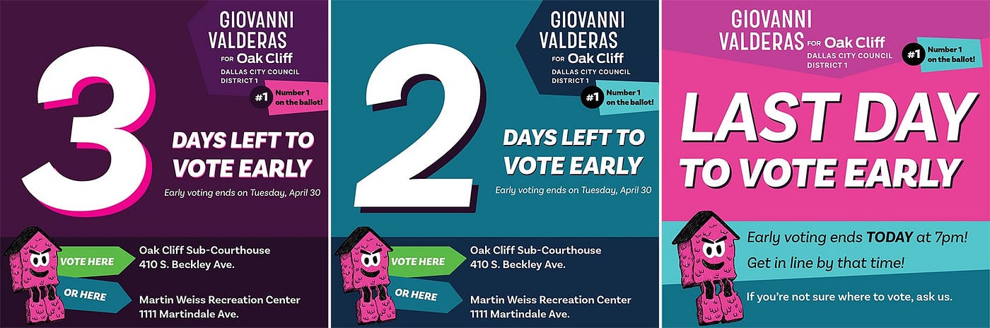
Yard Signs
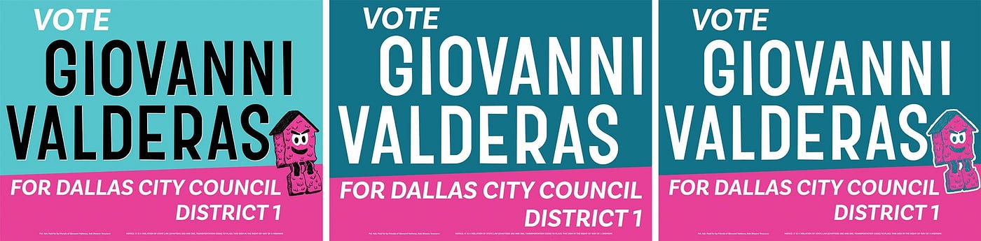
The yard sign design is what I would improve if I could redo the campaign. We had three different versions of the signs printed through the course of the campaign, and each version solved another problem, but I would have preferred to have one strong version of the sign — rather than three different designs.
The first version was designed with three colors and was too expensive to print again. Also, the blue color field was too dark in the final sign, so the black letters were unreadable at night.
The second version of the sign was designed with two colors to lower the cost of printing. However, the blue and the pink competed with each other in the casita illustration, so I removed the illustration to bring focus on his name.
People missed the casita illustration since it became such a strong symbol of the campaign, so we brought it back for the the third version. It’s still two colors, but the casita illustration isn’t as high contrast as I would have hoped. The signs were screenprinted so — in theory — the pink and blue could have been layered to create a third color for the casita that would have solved the contrast issue.
Lesson: Go to the printer to work these problems out with them.
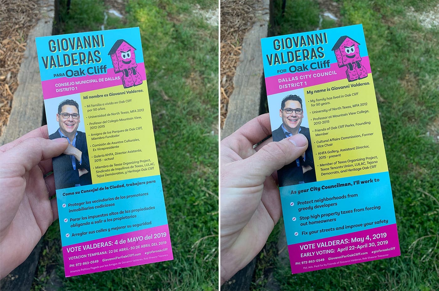
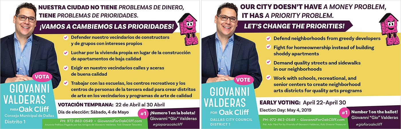
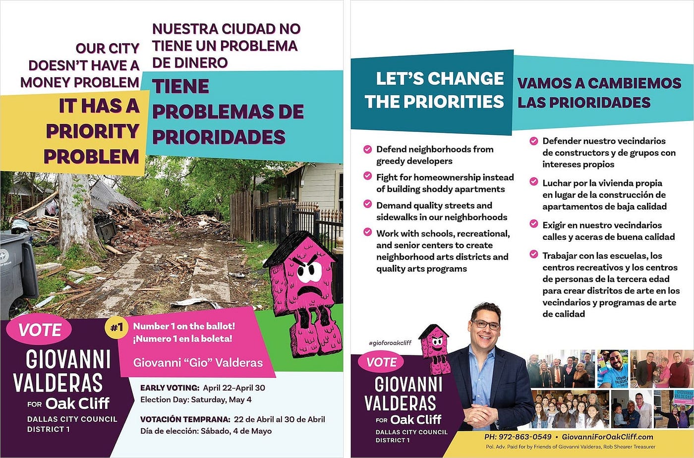
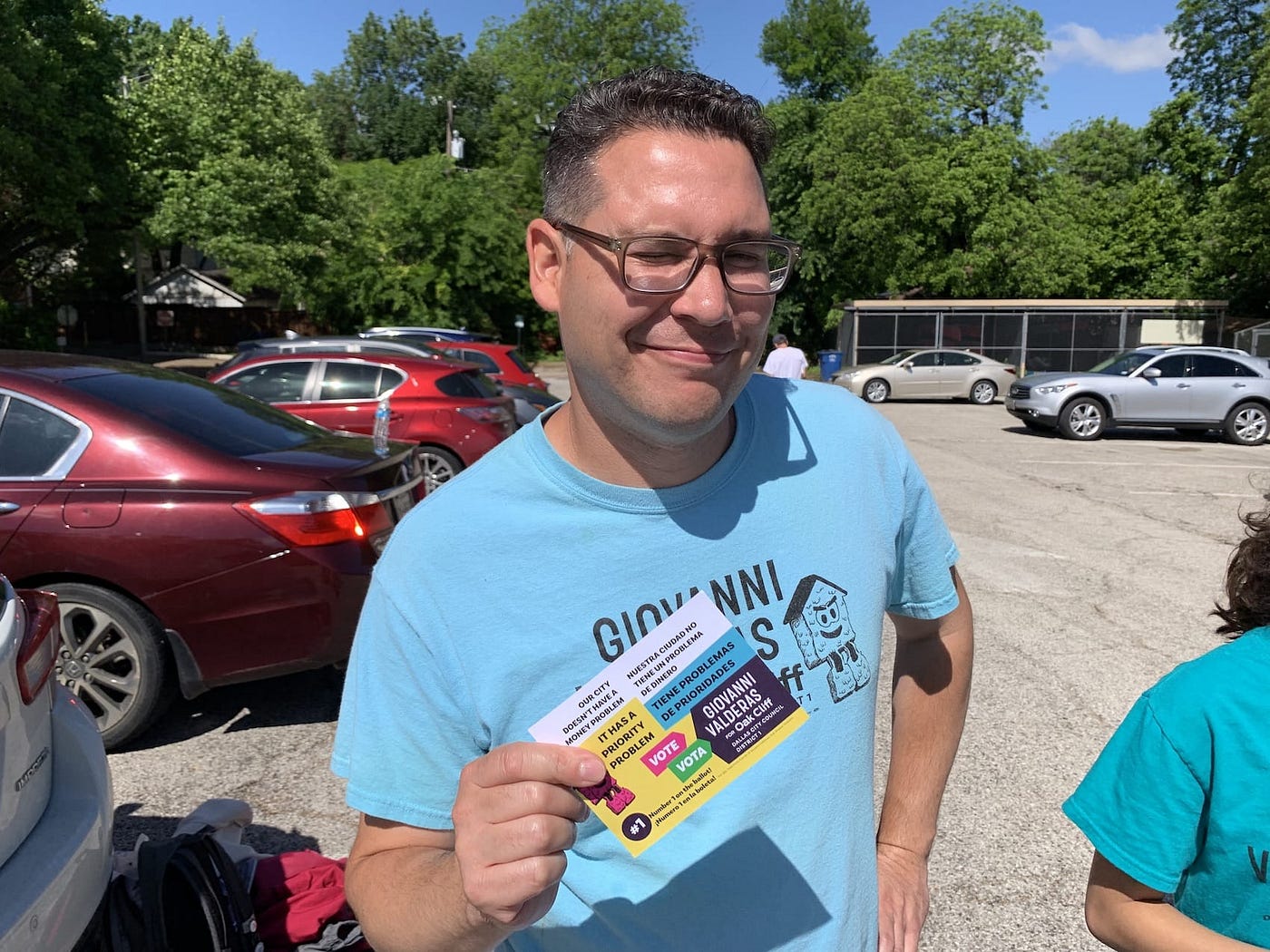
Handouts and cards
Giovanni’s district is heavily latinx and Spanish-speaking, so it was important to limit the language hierarchy between English and Spanish — English was not the default language. This is two sides of the same push card.
A big challenge throughout the campaign was using twice the amount of space as the other candidates to account for English and Spanish.
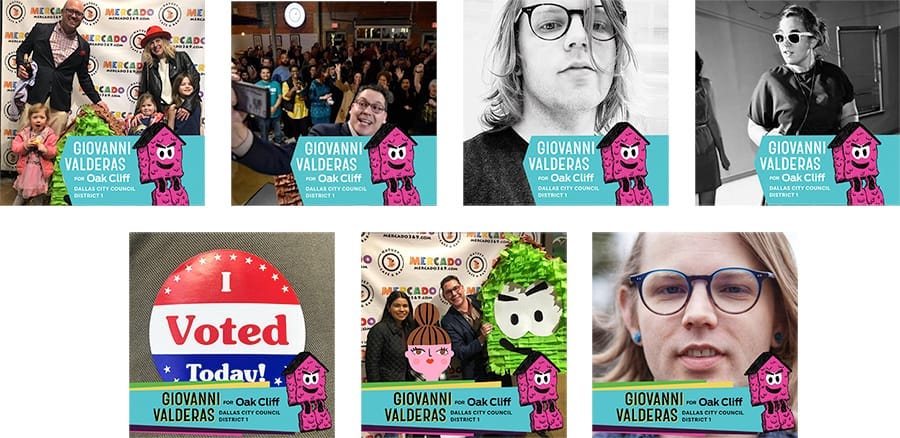
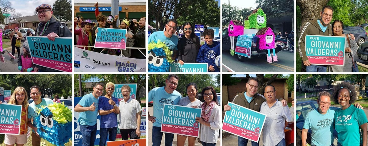
Social Media
Here are the final results
- Giovanni ‘Gio’ Valderas: 2,067 (34.69%)
- Jeremy T. Boss: 107 (1.80%)
- Sylvana Alonzo: 535 (8.98%)
- Chad West: 3,250 (54.54%)
5,959 total votes were cast. For context, there are 36,984 registered voters in District 1 and 77% are latinx. Many have lived there for generations.
Final thoughts
From a designer’s point of view, there was a lot more I wish I could have done, and there were some things I would have done differently if I could do it over. This was my first campaign I have ever worked and I had no idea how difficult it would be. Everything from the legal point of view to the print production was tough.
However, we received so much praise from the community and people familiar with running campaigns. We wanted the people in District 1 to know that they had someone in their corner, and they really have a voice.
The entire campaign — not just the visuals — embodied the spirit of Oak Cliff and what we were trying to do.
And I am exceptionally proud of that.